Technical Issues
Michael Hendry, March 7, 2000
Last Updated: September 10, 2000
|
Technical Issues Michael Hendry, March 7, 2000 Last Updated: September 10, 2000 |
|
| This is the general technical introduction to my web-texts of Propertius, Senecan Tragedy, Juvenal, and Claudian. I hope that it will be useful to those thinking of undertaking similar projects. | |
| There are several advantages to publishing Latin texts on the web: | |
|
1. |
The most obvious is convenience, for both reader and editor. My texts can be read anywhere in the world that is connected to the web, and that will soon be just about anywhere in the world. At the same time, the interval between final edit and publication is about five minutes, instead of months or years. |
|
2. |
Another major advantage is price. Though the labor involved is immense, actual monetary costs for the editor are very low -- many ISPs, like mine, provide up to 5 MB of web-space with a standard e-mail subscription, which makes the cost effectively zero. On the other hand, I have found that 5 MB is not enough for what I want to do, and am now spending quite a bit more to rent my own domain name and 30 MBs on my ISP's server. |
| The cost to most readers is also zero. Some, particularly outside the U.S., must pay by the minute for their telephone connections, but it is easy enough to download the texts for later reading. I have no objection to readers making single copies of my files on their own machines, as long as this is done for strictly personal non-commercial use. Republication in any form is of course prohibited, and quotations from my texts in (e.g.) a journal article require the same sort of acknowledgement as if they were published in book form. | |
|
3. |
Web texts can go through an infinite number of separate editions. These rolling updates mean that errata sheets are never needed. New work on an author can be taken into consideration immediately. My texts often include conjectures published in the previous month or two, though obviously not for long. |
|
4. |
Colors can be used to guide the reader's eye. This is
prohibitively expensive in printed texts. For web-texts, it only takes a few
minutes of extra labor and a few extra bytes, and bytes are cheap. I use black
for the primary matter (text and title), dark blue for the apparatus criticus,
medium blue for the character names in Senecan tragedy, red for the line
numbers, and gray instead of the usual angle brackets for deleted
lines. Different color schemes are possible, but I have aimed at ease of reading. I find that gray verses can be 'tuned in' or 'tuned out' as the reader desires. Similarly, the apparatus can be ignored or consulted as needed. In a normal text, the text-critically-inclined reader is constantly looking down at the apparatus to see if there is a note there. This is disruptive, particularly since the notes are generally lumped together in paragraphs, making it hard to find the right one. With my sideways format, the reader can see whether there is a note 'out of the corner of his (or her) eye' without actually looking at it, and can then decide whether to pause and read it, or keep on reading the text. I use a plus sign instead of Zwierlein's period for additional unnumbered lines. Some of these come from editorial rearrangement of manuscript lineation, others from editorial insertions to fill lacunae. The fact that the plus signs are red makes them less obtrusive than they would be if they were black. In other words, the larger size is balanced by the less obtrusive color. I have also used a horizontal red line in the left margin to mark transpositions, and, in Juvenal, a vertical red line to mark hiatus. Examples of both will be found in Satire 3, where lines 17-20 and 12-16 are transposed, and there is a hiatus in line 70. For Seneca and other dramatists, stage directions would be handy, as in (e.g.) Mastronarde's Teubner text of Euripides' Phoenissae. And metrical notes would be useful, particularly for the polymetric cantica of Seneca's Agamemnon and Oedipus -- not to mention Plautus. The problem with stage directions and metrical analyses is where to put them. The obvious place is to the right of the text, before the apparatus. However, whether they are given a column to themselves or put in the same column as the apparatus, some or all of the apparatus would tend to disappear off the edge of the page. No doubt some kind of pop-up note would be best. On the other hand, Catullus, Horace, and Martial can get by with a metrical note at the beginning of each poem, which can go to the right of the poem number, where there is no apparatus to interfere. |
|
5. |
There is less competition. A printed edition, no matter how good, has to compete against others, sometimes dozens of them. The competition is not particularly fair, since a better edition that is more expensive, or harder for most readers to get hold of (e.g. published in Poland or Portugal), or poorly printed, or published in a less prestigious series, will be at a disadvantage. It may also go out of print prematurely, thus handing over the field to worse rivals. Web-publishing is equally unfair, but in different ways, ways that I find advantageous. The fact that there are few, if any, other texts of my authors on the web, and none with an apparatus criticus, should make it easier to attract virtual readers, even those who might otherwise find my hospitality to conjectures distasteful, or might be inclined to prefer a text edited by someone better known. |
| There is one advantage that applies only to verse, not prose: | |
|
6. |
The principal novelty of my editions is the 'on line apparatus criticus' (a pun, of course). By putting the apparatus to the right of the text and abolishing the right margin, I can put every note on the same line as its text, which makes them much easier to find and read. The reader can scroll over to read the longer ones. This would obviously not work very well for prose, where there is no standard lineation. There are a number of implications, some good, some bad: |
|
a. |
Since a web-text has no fixed right or bottom margin, I use specific symbols to help the reader. The end of each file, including this one, is marked by a large red colophon (§), while the end of each line of apparatus is marked by the traditional double vertical slash (||). Without the latter, the reader would often be in doubt as to whether there is more apparatus to be seen by scrolling over. In effect, I am reinstalling the missing right margin on a line-by-line basis. |
|
b. |
One pleasing side effect to the on line (and off-edge) apparatus is that readers who print out the text will find it less useful than a book text, since much of the apparatus will be missing. |
|
c. |
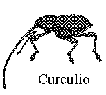
In order to put my weevil trademark in the upper right corner, while abolishing the right margin for the text, I have been forced to use tables within tables. This produces another not entirely unwelcome side effect, that Microsoft Word will not do a 'Save as DOC' on the file. This should help a little in cutting down on misuse of my texts. |
| These advantages to web publication are balanced by certain disadvantages: | |
|
7. |
It is difficult to keep the text and apparatus close together, but not too close, while not making the text column so narrow that lines are broken. After months of experimenting, I have finally (July 1st) solved this problem, at least for the moment, with a roundabout method. Please skip the rest of this paragraph if you are not interested in the technical details. The text table is defined with a width of 2400 pixels, which will be up to four times wider than the user's screen. (I can always increase this number, if an unusually detailed apparatus demands it.) The idea is to make it wide enough for any possible apparatus entry. If the three columns that contain the line numbers, text, and apparatus are not given specific widths, the browser will automatically distribute any extra space to all three columns, pushing the apparatus far off the right side of the screen. (There will always be lots of extra space to redistribute, since the apparatus is never that wide.) If the columns are given specific widths, in either pixels or percentages, these widths are likely to be wrong for some combinations of screen size and font size, with the result that either the text will have some lines doubled up (text column too narrow) or the apparatus will be much too far to the right of the text (text column too wide). The solution is to define the text column in pixels so that it is much too narrow for any likely screen and font combination, say 200 pixels. (It could be 20 or even 2, but that would make the file impossible to edit in HoTMetaL, which is what I use, since it ignores NOBR commands when in editing mode.) The line number and apparatus columns are similarly defined in pixels to fill up the rest of the defined width of the table (usually 40 and 2160). This will cause the text to be doubled up in many places. I then find the longest line of text in that particular file, add eight unbreakable spaces (ampersand + nbsp + semicolon) at the end, and put a set of no-break commands (NOBR and /NOBR in angle brackets) around the whole line, including the added spaces, to make it unbreakable. This forces the browser to expand the text column just enough to contain the unbreakable line and its trailing spaces, but no further. All the other lines, being shorter, will also be printed correctly. The eight spaces ensure that this will work even if I miscalculate and some other line is slightly longer than the one selected, while putting an aesthetically pleasing space between the end of even the longest line and the left edge of the apparatus. My method seems to work on Explorer and Netscape. Please let me know if it does not work on your browser. There are other methods that ought to work, according to the HTML manuals, but do not. The one disadvantage is that some texts have longest lines that are far longer than the shortest or even the average, so having the apparatus on the right still looks ugly. The in-line character names in Senecan stichomythia are particularly pixel-intensive. |
|
8. |
Web-texts are far less permanent than books. This is the flip side of §3. If I move to a city outside my current ISP's range of coverage, my website will have to move with me, and all references to it on other sites will be obsolete. It has been nearly a year now since I moved it from Erol's in Virginia (http://www.erols.com/curculio) to Glass City Internet in Ohio (http://www.glasscity.net/users/curculio), and inquiries on search engines such as Altavista, Google, Infoseek, and Lycos still give more references to the old address than the new. Even a permanent home for the editor would not necessarily provide a permanent web address, since universities and other stable institutions seem to change servers every five years or so. I have now taken care of the short-term problem by acquiring my own domain (http://www.curculio.org), but this only works as long as I keep paying for it myself. If I ever move my site to a university or other institution, I will save money, but will also be subject to the occasional involuntary address change, as mentioned above. A more general problem is that any form of web-text permanence beyond ten or twenty years is hard to predict or even imagine. |
|
9. |
The web does not handle Greek well, though this should change in the next few years. In the mean time, the lack of a convenient Greek font affects the apparatus even in Latin authors. (It also affects the text in authors such as Macrobius and Gellius who insert bits of Greek into their Latin prose, though that does not apply to my authors, except for a few lines in Juvenal, where I transliterate.) Book editors often use a small omega to represent all of the manuscripts, and the 'stigma' sign (resembling a stretched-out end-of-word sigma) to represent one or more late manuscripts. I have used various substitutes for these, as specified in the introductions to each author. The other possibility would be to insert tiny graphic (GIF) files with pictures of the Greek symbols. The difficulty with these is that they do not change size when the reader changes the font size of the rest of the document, so they can end up looking repulsively large or small. They also take time to load, leaving ugly gaps until they do. |
|
10. |
Most web texts, including this one, are not refereed. This is not as bad as it sounds, for several reasons: |
|
a. |
Refereeing as a guarantee of quality is overrated. Plenty of nonsense (to put it politely) is published in refereed journals, and I have submitted enough articles to such journals in the past to have a fairly well-developed sense of quality. In any case, most of the original conjectures printed here have been published in refereed print journals, or soon will be. Those that flunk the refereeing process are likely to disappear from the web-text. |
|
b. |
There is less excuse for mistakes in a web-text, since there is no editor or typesetter to blame. Any mistakes in this site can be attributed to me and me alone, and that tends to make me more careful than I might be if I had an editor and a couple of anonymous referees to lean on, and to blame if something goes wrong. On the other hand, a site such as this one can be labeled a work in progress, which can easily excuse editorial sloth and carelessness. There is also the problem that pressure to finish up a text or an entire author and post it on the web may cause one to cut corners. |
|
c. |
New forms of reviewing are being developed for the new medium. When it is nearer to something resembling completion, I intend to submit my site to the judgment of BMERR (Bryn Mawr Electronic Resources Review). Except where an editor is unusually bull-headed, there is no real difference between refereeing and reviewing for a continuously-updated text. |
|
d. |
Send in your comments. If any eminent Propertius or Seneca or Juvenal or Claudian scholars care to provide quotations for my virtual dust jackets, I will be glad to print them. Criticisms are also welcome. Since web-publishing is a continuous process, well-founded negative remarks can usually be nullified by reediting the text, while positive judgments are more permanent. |
|
11. |
Web texts are easy to steal. Mine are copyrighted. Users are welcome to download single copies for their own off-line use, but they must not be copied, sold, republished, or otherwise misused or abused. My formats, on the other hand, are partly experimental, and may be borrowed, on four conditions: |
|
a. |
Let me know that you are doing so, and for what authors. Cross-links would be appropriate, and acknowledgements are a moral obligation -- quite possibly a legal one, too, though I hope I will never be forced to find out for sure. |
|
b. |
Choose other authors. If you wish to publish competing web-editions of the same authors I have published, you had best design your own format from scratch rather than borrowing mine. |
|
c. |
Misuse of others' texts is not my responsibility. Anyone who uses my formats to display someone else's copyrighted text is on his (or her) own. |
|
d. |
Do not borrow the trademark (or the illustrations). I will sue for my weevil. |
| Anyone who complies with these four conditions is welcome to borrow my formats complete, right down to the color schemes, to publish other texts. As long as your trademark is not a Curculio, there is no need to call your site Cimex, Pulex, Pediculus, or Ricinus and add the appropriate illustration -- though it would be amusing. | |
§